GUIDE TO CHOOSING THE RIGHT PAINT COLOUR
“Feeling at home” is a strong sentiment in which colours play a significant role.
Wrong or mismatched tints of colour not only ruin the look of your interior space but are also more likely to contribute to your negative mood and feelings of discomfort.
Confused about what colour you want for your home? Read on to understand what colour makes you happy and how to finalise the best paint colour for your living space.
1. Know your hues
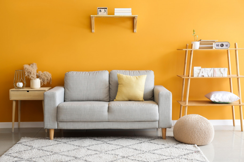
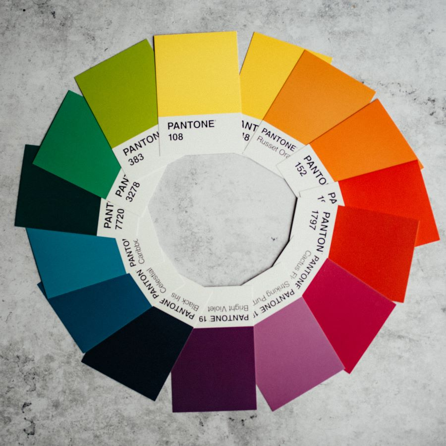
Hues are colours in their primary form, the colours that you generally think of when you hear: red, blue, green, yellow or purple. Since colours can influence mood and behaviour, make sure that your colour choice connects with the mood you want to create in that space. For example, blue is often associated with calmness and purple is known for its luxurious feel.
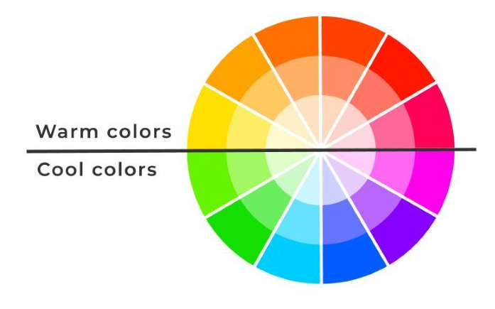
Chroma is the saturation or strength of the hue. Now that you know what hue you want for your space you can adjust the saturation to suit its dimensions. Warm colours can make large open spaces feel a little cosier whereas cool colours can make a room feel spacious and relaxing.
Lightness is the intensity of the colour, how light or dark a colour it is. You can choose the lightness of the colour based on your preference.
The shinier the finish of the paint the more light it reflects and the easier it is to see imperfections on the wall, which is why most people prefer a flat finish.
Your favourite colour can overrule all the above guidelines. Your brain knows what it needs and that is what it gets attracted to, so choose the colour that makes you happy, it’s your best pick.
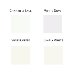
2. White paint
White paint needs its own section for obvious reasons. It is the most preferred wall paint colour for many. There are over 900 hues and tints of white paint. Lighting, finishand undertones are some of the things that can affect how white paint looks on your home wall.
Lighting:
Here’s a little Vastu for your white paint. If a room is south facing the light hitting the wall is warmer hence giving the paint a warmer look and if a room is north facing the paint will look cooler.
Undertones:
When buying white paint, look for the undertones. White paint is mostly mixed with slight tints of blue or pink. Undertones can clash with other colours in the room if not chosen careful. You don’t want a warm undertone in a cool coloured room.
Finish:
White paint can be flat, matte, eggshell or glossy. Choose flat for a soft look, matte for a more luxurious look and glossy to reflect more light.
White ceilings in specific are preferred by a majority of people as they reflect the most light. Not having a white ceiling can affect the amount of light in the room.
3. Envision the colours
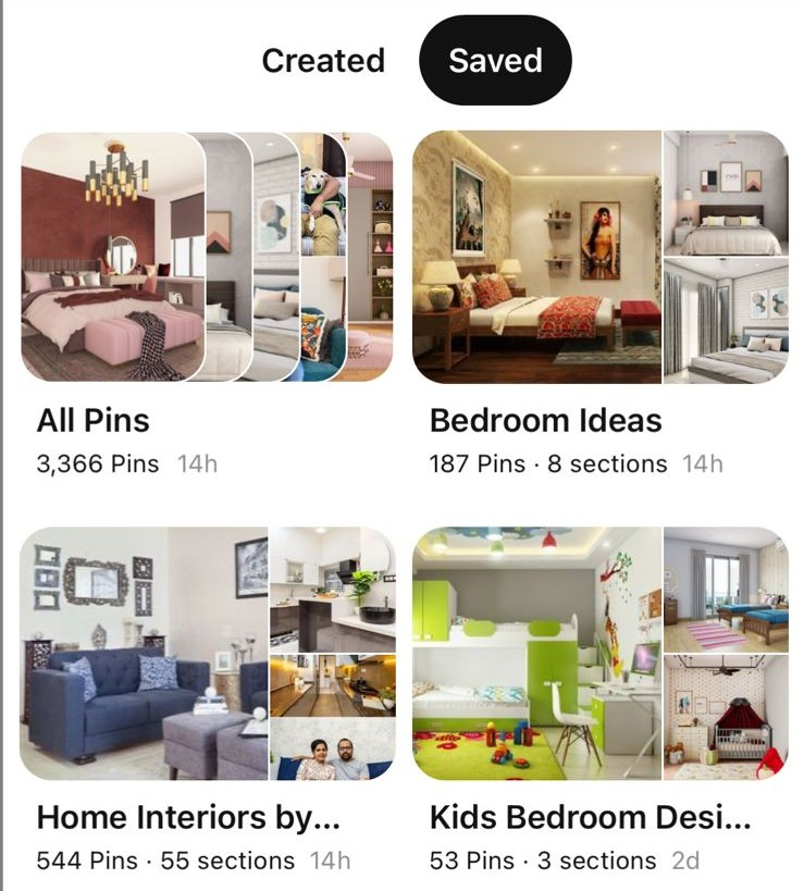
Mood boards are a great way to organise your ideas and look for inspiration in the process. Using Pinterest to create a mood board according to your colour pallet can really help you envision your dream home and fixate on a colour scheme.Search for room décor ideas on Pinterest and save everything you like.You can also see what your home could look like with the help of apps that use AI to virtually try paint colours on your home walls.
4. Swatch testing
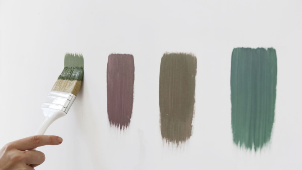
The virtual world is good for envisioning but paint can always look slightly or largely different in reality. There are no short-cuts to actual testing. Paint shops provide 200ml paint samplersthat cost less and can be used to test the paint on the walls of your house. Choose three shade samples with subtle undertone changes to start off with. Swatch the paint samples directly on the wall and not any other surface. Choose the colour of the floor or tiles prior to this to see if the wall goes with the floor colour. Always use two coats of paint. Wait for it to dry completely. The paint colour may look different in different rooms and at different times of the day due to lighting.